
Obvi
Client
Obvi
Services
UX & CRO
UI Design
Role
Senior Creative Lead
Reimagined the homepage experience to create a clearer path to discovery and conversion. Restructured the content around health goals, product benefits and best sellers, while introducing stronger social proof, educational content and community stories.

Shifting the homepage toward discovery
Led with a stronger brand proposition and a more focused hero, communicating Obvi’s broader Beauty & Nutrition offering rather than promoting a single product or promotion.
Reworked Best Sellers into a more curated merchandising experience likend with "Shop by concern" with category filters and clearer product cards.
Added educational content to help customers understand ingredients, benefits and use cases, giving the brand an opportunity to build confidence before asking for the purchase.


Guiding customers toward the right product
Created a "Not Sure Where to Start?" pathway to support customers who don't know which product is right for them, using the product quiz as a guided discovery tool.
Introduced goal-based discovery with clear entry points such as Lose Weight, Feel Great, Glowy, Dewy Skin, Strong, Luscious Hair and Balance & Hormones, helping customers shop based on their needs rather than product names.
Built in social proof throughout the journey, including press mentions, customer testimonials and the Obvi community, instead of relying primarily on product claims.

Making discovery more intuitive
Created more opportunities for discovery beyond the homepage, connecting health goals, products, educational content, community and social content into one ecosystem.
Improved the overall visual hierarchy, giving promotional content, product discovery, editorial content and trust-building sections distinct roles instead of competing for attention.
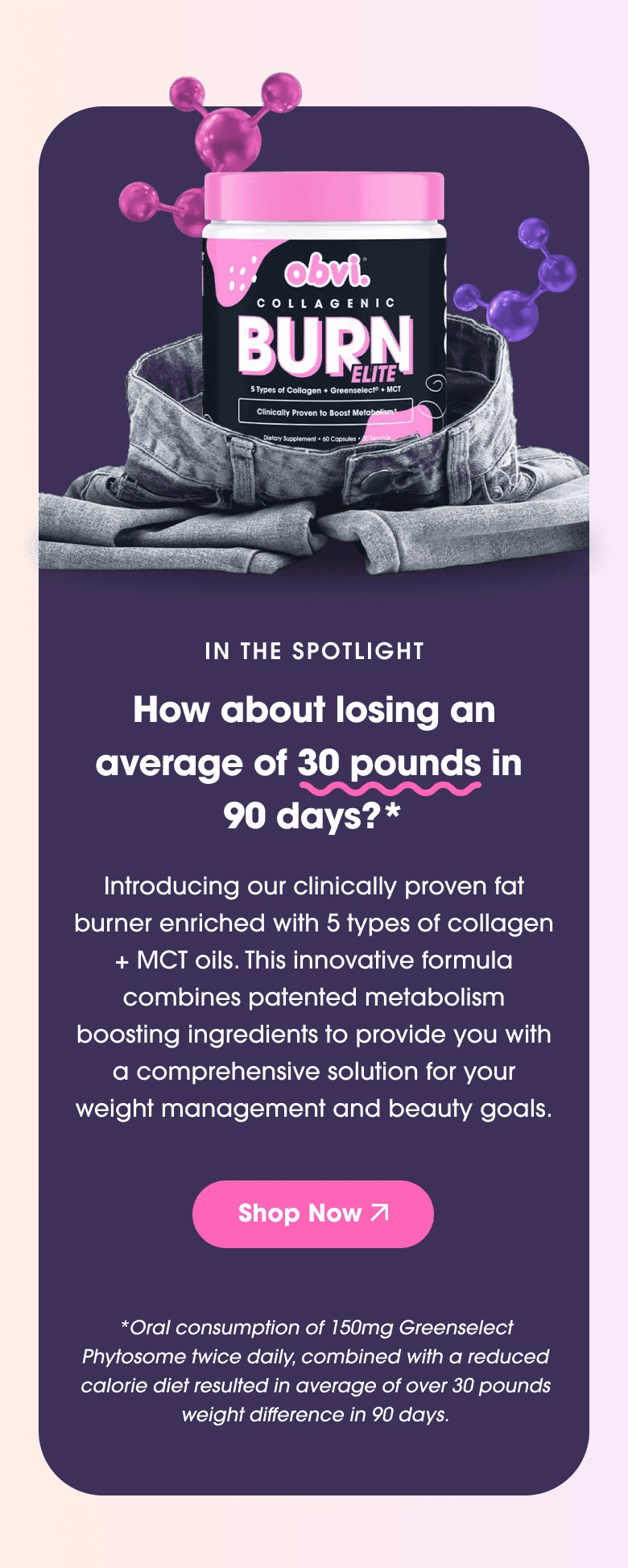

Outcome: Visual and content hierrarchy
The redesign focused on reducing the cognitive load of choosing from Obvi’s extensive product range. Instead of immediately presenting customers with a large product catalogue, the new experience introduces several guided entry points, from health goals and a product quiz to curated best sellers and educational content. This creates a clearer progression from "What am I looking for?" → "Which product is right for me?" → "Why should I trust it?" → "Shop."
Obvi
Client
Obvi
Services
UX & CRO
UI Design
Role
Senior Creative Lead
Reimagined the homepage experience to create a clearer path to discovery and conversion. Restructured the content around health goals, product benefits and best sellers, while introducing stronger social proof, educational content and community stories.
Shifting the homepage toward discovery
Led with a stronger brand proposition and a more focused hero, communicating Obvi’s broader Beauty & Nutrition offering rather than promoting a single product or promotion.
Reworked Best Sellers into a more curated merchandising experience likend with "Shop by concern" with category filters and clearer product cards.
Added educational content to help customers understand ingredients, benefits and use cases, giving the brand an opportunity to build confidence before asking for the purchase.


Guiding customers toward the right product
Created a "Not Sure Where to Start?" pathway to support customers who don't know which product is right for them, using the product quiz as a guided discovery tool.
Introduced goal-based discovery with clear entry points such as Lose Weight, Feel Great, Glowy, Dewy Skin, Strong, Luscious Hair and Balance & Hormones, helping customers shop based on their needs rather than product names.
Built in social proof throughout the journey, including press mentions, customer testimonials and the Obvi community, instead of relying primarily on product claims.

Making discovery more intuitive
Created more opportunities for discovery beyond the homepage, connecting health goals, products, educational content, community and social content into one ecosystem.
Improved the overall visual hierarchy, giving promotional content, product discovery, editorial content and trust-building sections distinct roles instead of competing for attention.


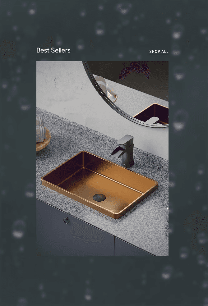
Outcome: Visual and content hierrarchy
The redesign focused on reducing the cognitive load of choosing from Obvi’s extensive product range. Instead of immediately presenting customers with a large product catalogue, the new experience introduces several guided entry points, from health goals and a product quiz to curated best sellers and educational content. This creates a clearer progression from "What am I looking for?" → "Which product is right for me?" → "Why should I trust it?" → "Shop."


Obvi
Client
Obvi
Services
UX & CRO
UI Design
Role
Senior Creative Lead
Reimagined the homepage experience to create a clearer path to discovery and conversion. Restructured the content around health goals, product benefits and best sellers, while introducing stronger social proof, educational content and community stories.

Shifting the homepage toward discovery
Led with a stronger brand proposition and a more focused hero, communicating Obvi’s broader Beauty & Nutrition offering rather than promoting a single product or promotion.
Reworked Best Sellers into a more curated merchandising experience likend with "Shop by concern" with category filters and clearer product cards.
Added educational content to help customers understand ingredients, benefits and use cases, giving the brand an opportunity to build confidence before asking for the purchase.


Guiding customers toward the right product
Created a "Not Sure Where to Start?" pathway to support customers who don't know which product is right for them, using the product quiz as a guided discovery tool.
Introduced goal-based discovery with clear entry points such as Lose Weight, Feel Great, Glowy, Dewy Skin, Strong, Luscious Hair and Balance & Hormones, helping customers shop based on their needs rather than product names.
Built in social proof throughout the journey, including press mentions, customer testimonials and the Obvi community, instead of relying primarily on product claims.

Making discovery more intuitive
Created more opportunities for discovery beyond the homepage, connecting health goals, products, educational content, community and social content into one ecosystem.
Improved the overall visual hierarchy, giving promotional content, product discovery, editorial content and trust-building sections distinct roles instead of competing for attention.

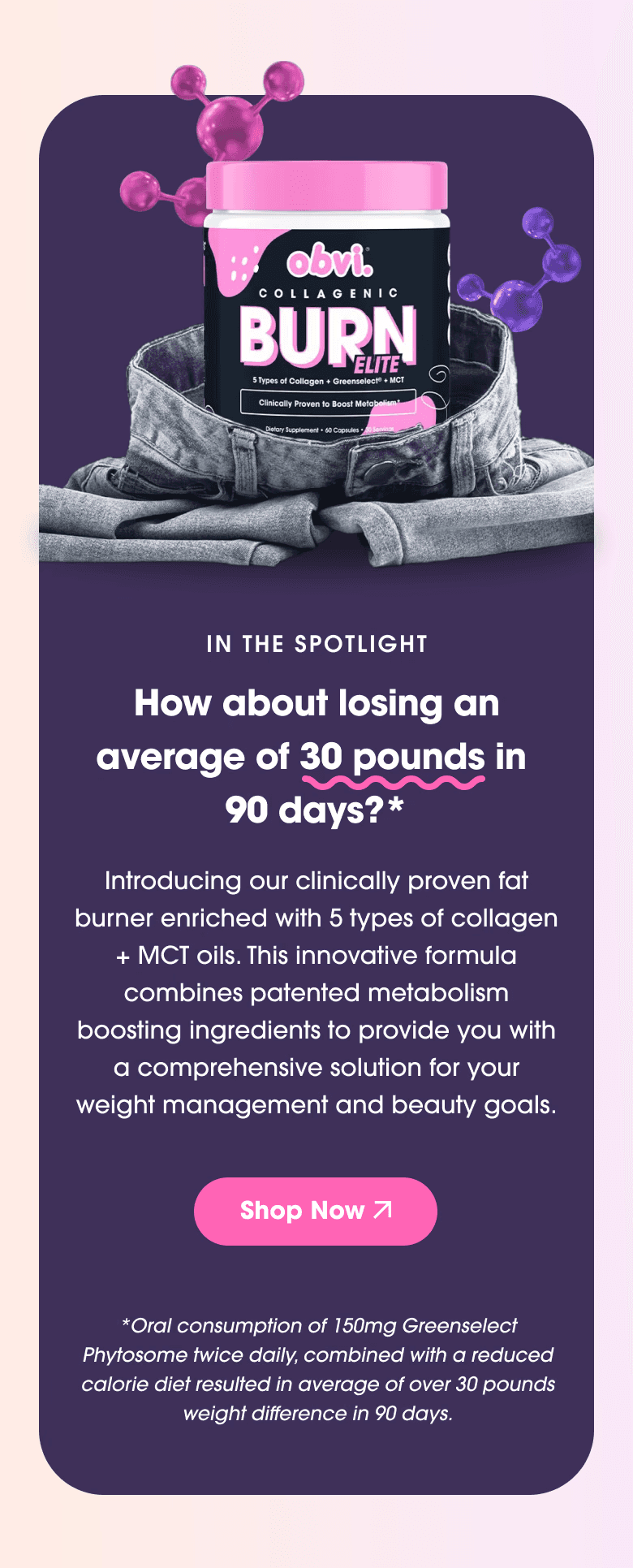

Outcome: Visual and content hierrarchy
The redesign focused on reducing the cognitive load of choosing from Obvi’s extensive product range. Instead of immediately presenting customers with a large product catalogue, the new experience introduces several guided entry points, from health goals and a product quiz to curated best sellers and educational content. This creates a clearer progression from "What am I looking for?" → "Which product is right for me?" → "Why should I trust it?" → "Shop."